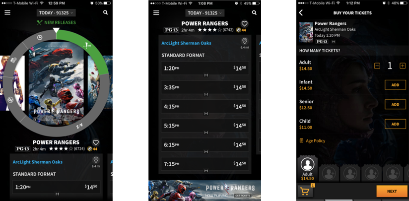
Current Design (ca. 2017)

Current Design (ca. 2017)

I'm a huge movie buff, watching a new movie almost every week. I found the Atom app with a refreshingly dark and modern UI, but it had some issues. I decided to give the app a UX overhaul. I gave myself a 12 hour time table and got to work.
*Note: This design exercise was just for fun and is in no way affiliated with the official Atom team.

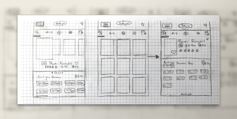
Like most projects, I started off with some rough sketches. After sketching about a dozen thumbnails I narrowed it down to the best 3, which you can see above.

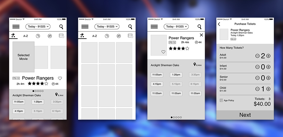
I next moved into hi-fidelity wireframes in Sketch. The first two screens are different ways to display the assortment of movies on the app's landing page. The first screen is an attempt to keep a highly interactive model, while making it less confusing. The second screen is a more traditional grid layout that maximizes visibility. Third screen is detail view, while the fourth is the first step in purchasing your tickets.
Interactive Prototype Using Flinto for Mac, I built a fantastic interactive prototype that could be used on the mac or iPhone. I love Flinto because it gives a very native iOS feel to your prototypes and helps bring your vision to life.
Press Play on the video on the left to view the Prototype.