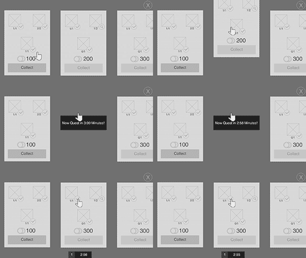
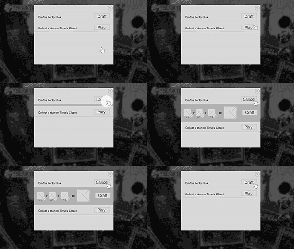
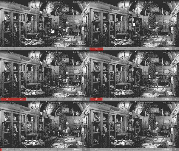
The final phase of the project was creating animation prototypes to hand off to art and engineering. These were rough guidelines for how important interactions should feel to the player. These were created with Adobe After Effects.


BigPoint was mid-development for their new Hidden Object game when they realized they needed to completely overhaul the game's UX. They hired me on for a 6 week contract to design an all new experience, including wireframes, user flows, and animation prototypes.
core loop & gameplay features
The first task was to map out User Flows for the Core Loop of the game, as well as the other gameplay features. This helped find confusion and pain-points that were present in the current gameplay. Through collaboration with the PM, we were able to map out the entire game in just a week and a half.
The majority of the 6 week contract was dedicated to perfecting the wireframes. These wireframes covered every screen in the game, from the initial loading screen to the final win screen for each level, and everything in between. This was a monumental collaborative effort between UX, Art, & PM to complete so efficiently. In the end, we had layouts that everyone was happy with and that really provided the best experience for the player.
(I'm unable to feature examples that include original artwork by the BigPoint team.)
The final phase of the project was creating animation prototypes to hand off to art and engineering. These were rough guidelines for how important interactions should feel to the player. These were created with Adobe After Effects.
