Discovery:
eharmony was having trouble retaining both free and paid users. By analizing retention data and user feedback, we determined that free users were leaving because their experience was too limited and paid users were leaving because of a lack of active users.
Challenge:
Develop a redesigned experience for free users that has potential to increase retention and subscription rates of free users, while also increasing satisfaction and re-subscription rates of paid users.

Redesigning the free experience in such a meaningful way was a monumental effort. The early phase of this project was spent blue-sky ideating around all the different ways we could improve the free experience.
This was done with a series of whiteboarding sessions between UX, Product Management, Marketing, and Data Analytics; we utilized UX processes such as Jobs To Be Done and How Might We…
The result of our research and ideation was a plethora of plausible ideas around the free experience including ideas like gamification, timers, virtual assistants, and more. We then used categorization and dot voting to narrow down our choices to the following categories:

Matches

Profile Content

Communication
We hypothesized that, by offering more freedom in these categories, we could keep our free users engaged for longer, therefore expanding our active match pool for our paid users.
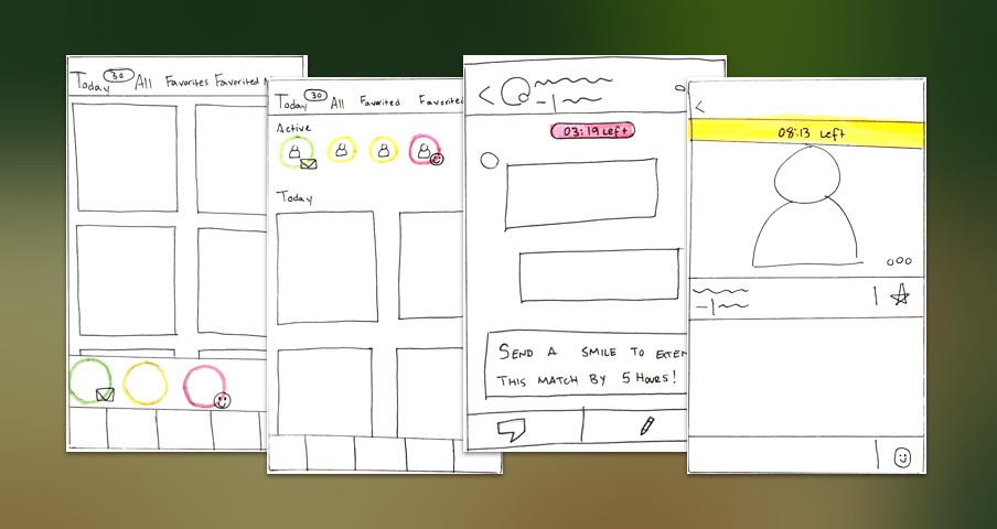
Through a series of meetings, we narrowed down our choices even further in order to start rounds of rough sketching. This helped us get a feel for how the free experience ideas would work in-product, and also how they would co-exist.

Using these sketches, we were able to pair it down to the following concepts, which were used for User Testing:
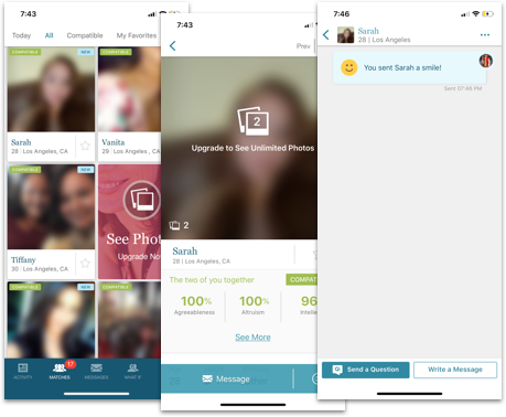
Matches - Daily Match Delivery
Concept
Each day we deliver a number of new matches. We use a new interface that focuses on each match individually. There may be a timer displaying how much time is left before the matches are replaced.
Hypothesis
- Displaying a timer will heighten sense of urgency
- Will increase engagement between matches
- Will increase logins
- Users will receive more communication on average
- Users will understand that matches get replaced daily
Profile Content - Restricted Access to Content
Concept
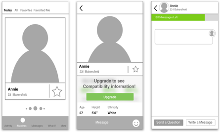
Access to some profile content may depend on your subscription status. Also allow free users to see one profile photo.
Hypothesis
- Users expect to see at least one photo of their matches
- Limited Compatibility information is perceived as useful
- The complete Compatibility information has enough perceived value to motivate subscription
Communication - Full Communication with Limited # of Matches
Concept
In the past, free users could only use pre-composed messages and smiles as forms of communication. In this concept, we allow full access to communication options but only for a limited number of matches.
Hypothesis
- Users expect to be able to send custom messages to their matches
- Limiting the number of matches will place more sense of importance on the messages
- Allowing free users to communicate with even a small amount of users will increase engagement across the board, increasing satisfaction of paid users.
User Testing
With these concepts agreed upon, we created some wireframes and put together a deck for remote user testing.
We tested with users who have used any dating app in the past.
From the results, we discovered that users love the idea of being able to only communicate with a limited number of matches because it would decrease the number of “Hi” or “Sup” messages, which aligned with our hypothesis.
We also found that users felt like a visible timer created too much anxiety.
And finally, users were unsure about whether or not they would still subscribe for compatibility, because they would have to know what information it provided.

Results
With most of our hypotheses validated via the user testing, we felt confident that our changes would be beneficial to both our free users and our paid users as well. We presented our findings to the team and we included suggestions on how to move forward by implementing the features bit by bit in a ramp-up process.
