Discovery:
We reviewed App Rating complaints to find areas of improvement that could be low-hanging fruit for quick success. A common complaint was from people who played on both mobile devices and our Facebook platform.
Challenge:
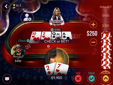
Design a betting interface that has feature parity with our Facebook product and is easy to use on mobile.
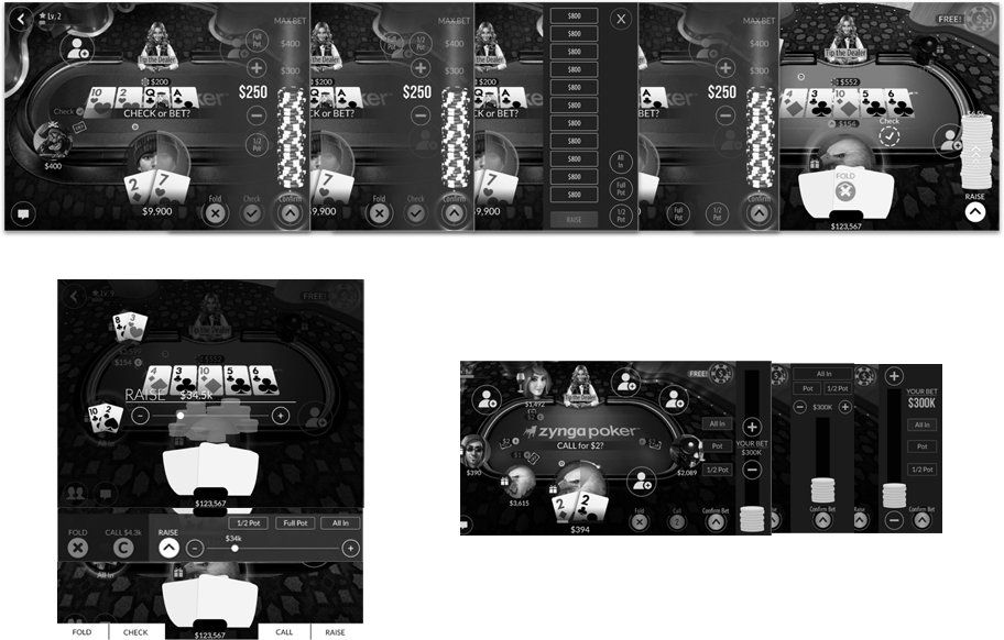
I kicked off this project with a whiteboard session with another designer about ways to effectively place these elements in the game. We ran the gamut of the simplest implementation to the most radical, and then converted these to high-fidelity wireframes.
With our high-fidelity wireframes, we performed dot-voting with a cross-discipline group to narrow down our choices. We then took these choices and performed paper prototype user testing with players. With help from all of this , we were able to narrow down to one design with a few small additional tweaks.
Final Design
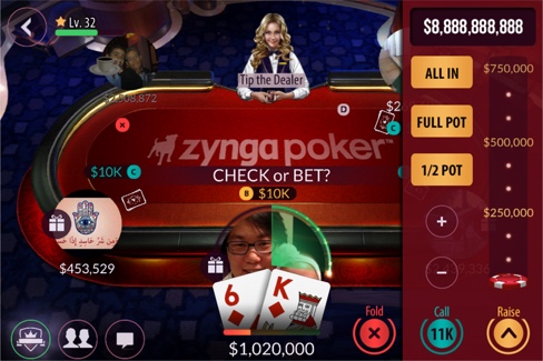
Easier to select specific bet amounts with the All In, Full Pot, and 1/2 Pot Buttons.
Better clarity of amount being bet with the large display at the top.
New opaque design improves aesthetic and clarity by more clearly separating it from the table
